WHAT IS A STYLE GUIDE?
A style guide is a document that contains a set of standards for designing, writing and formatting communication material. The style guide sets out a series of pre-defined elements, graphics and established rules to serve as a basis for communication work.
When you need to have your material translated, it can be extremely useful to have style guides for the separate languages, so translators can make allowance for the cultural differences involved.
TYPES OF STYLE GUIDE
Linguistic style guide
Linguistic style guides are often used in the context of translation. They contain specific terminology, for example, which helps determine the style of a given text. Linguistic style guides can also define standards for grammar, punctuation, tense, tone, choice of vocabulary and spelling.
In connection with technical translation, for instance, you may have strict requirements on your terminology, and in this context a style guide can prove extremely useful in ensuring correct translation of your texts.
Graphic style guide
Graphic style guides present general design principles which define your graphic idiom. They visually illustrate your company’s image, identity, values and style, and they supply templates for your projects in order to ensure a coherent and consistent expression.
Graphic style guides are also used in the context of translation. If, for instance, you need to have a brochure translated, it can be crucial to have a style guide that defines how you deal with texts of different length, given that text length often differs between languages.
Not all companies differentiate between the two types of style guide, because they can easily be combined in a single document!
THE CONTENTS OF A STYLE GUIDE
Style guides naturally vary from one company to the next, but here you can see four elements you will typically find in a style guide:
Logo
Your logo is at the heart of your company’s visual identity. For this reason, it is essential to establish guidelines for its use – especially when you commission external suppliers to handle the graphic work. Typography
A consistent element in your communication via various media is the typography, i.e. the fonts and pitches you use and the various combinations that apply in different contexts. It is essential to lock in the hierarchy so as to ensure that you establish coherence across your written material. Make sure to define the typography for your headers, subheaders and body copy in advance.

Colour scheme
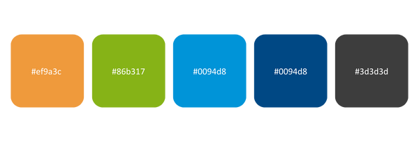
Colours play a major role in identifying your company. It is therefore important to define a colour scheme that not only contains the colours you use, but also explains how, when and where they are to be used.
 Jargon
A large part of your company’s personality finds expression through your “voice”. It is essential to define how your company expresses itself and communicates, because this accounts for a significant part of your identity. Do you adopt a polite, formal tone? Or is your style a little more informal and down-to-earth?
What is more, for many companies it is not simply a question of taste, but rather an absolute necessity that they use the correct terms. In the context of technical translation, there may also be specific words which, for legal or safety-related reasons, have to be used in a specific way.
6 SIMPLE STEPS FOR CREATING A STYLE GUIDE
When you need to prepare a style guide, there are several things you have to consider before you start. Firstly, it is essential to have a clear definition of your company: what is your identity? How about your personality? And in particular: what signals do you want to send to the world around you?
This might all look a little bit complicated, so here’s a condensed guide to help you get started:
#1
|
Define your company – who do you want to reach with your communication? |
#2
|
Define the guidelines for your logo For example: Version 1 of the logo must always be displayed with XX pixels of space on all sides, or the logo must never be used in negative format. |
#3
|
Define your typographical hierarchy For example: Write your headers big and your body copy smaller. Define which fonts are to be used, how and in which combinations. |
#4
|
Define your colour scheme |
#5
|
Define your tone of voice For example: Are you on informal terms with your target group? Is your tone dignified, youthful, humorous, detached or ...? |
#6
|
Define your visual style For example: Are there specific icons, figures or illustrations you want to use? How about the criteria that apply to the types of image you want to use in your material? |
Still not quite sure where to start? Then let us give you a hand.
It takes experience and, sometimes, a language expert to develop an effective style guide – particularly in multiple language combinations. We’re more than happy to help you hit the bull’s eye in your work to define your company.
