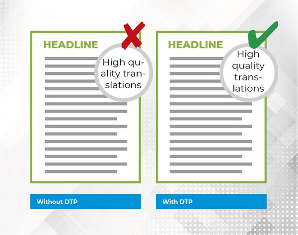
If you care about making sure your documents look professional and of a very high quality – if you want your text to sparkle – then you should seriously consider professional layout. There are many good reasons why professional translation agencies also have their own in-house layout departments. Like many other copywriters, technical writers, content creators and other professional writers, you almost certainly already have an okay level of graphic design skills. At the very least, you are able to make your text or document look good.
But when it comes to translating the work into one or more languages, other factors come into play. There is a huge number of other aspects related to design, layout and polishing that can make a translation a lot more difficult than you perhaps thought. You will only just discover or realise that many of these aspects are an issue after you get the material back in several different language translations. This is why translation agency in-house layout teams are so important. They are specialists who are trained in spotting layout pitfalls in files that are to be translated. They save you time and money, and above all, all the pain and frustration with format.
Professional layout is also called DTP. DTP is the abbreviation of Desktop Publishing, and it is the term used for the graphical design processing of your translated files. DTP is carried out by expert graphic design artists, who know what the challenges are when it comes to formatting and how to solve those challenges.
When you require a professional translation of a text and you contact a translation agency, you will most likely be asked some additional questions relating to the task. One of those questions will be about layout. But what is involved when you choose professional layout for your translated texts? And why should you prioritise it? Find out in this article.
We have asked our layout specialists to show us the difference between translations with and without professional layout. We have chosen six examples, which you might be familiar with from your daily work routines.
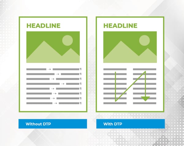
ANCHORED OBJECTS
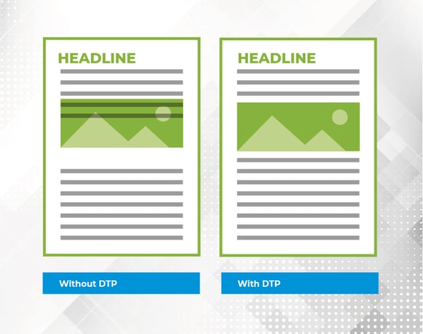 If your file contains images or illustrations, you obviously want them to appear in the text where they are supposed to appear. But if they are not formatted correctly in relation to the text they are in, there is a risk that the text and the image will obstruct each other. And how do you find the correct positioning if you do not understand the language that the text has been translated into?
To avoid the issue, our graphic design experts make the correct anchoring of all of the elements in your file that we want during the file preparation, so that they will be positioned properly after the text is translated.
WORD WRAPPING
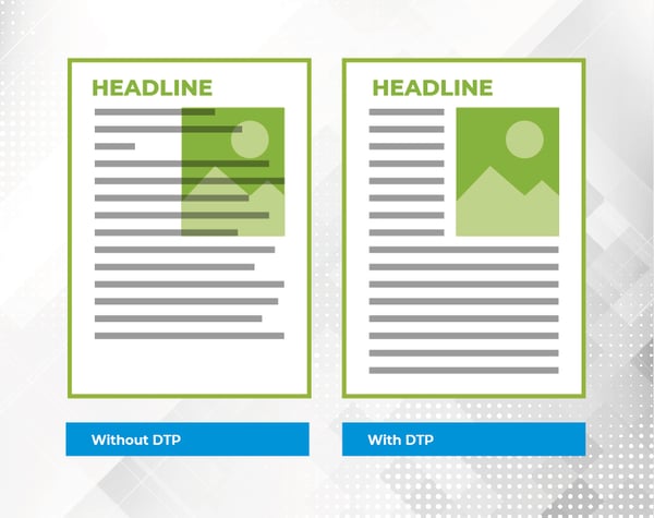 Hard and soft returns are great for a lot of things. But what if you have a file where the text interplays with the visual content such as images or graphics, so there is no way around it? In other words, the text must this be set out correctly.
Otherwise, the result can be a translated file where the text runs over visual elements or is hidden behind them. The amount of space different languages fill in relation to written text can vary a great deal. For example, German takes up approximately 25% more space than English.
If your word wrapping is incorrect there is a danger you may miss it, and important information is lost because it becomes hidden.
HYPHENATION
 A tiny thing that can be a giant irritation for almost every reader: incorrect hyphenation.
Done incorrectly, it can make your text appear unprofessional and make it difficult to read.
Hyphenat-ions can really me-ss things up. Don’t you agre-e? The challenge is even greater when dealing with hyphenation in a foreign language that you have limited knowledge of.
It is therefore very advisable that you get someone who is competent in the language to check the text.
BULLET POINTS
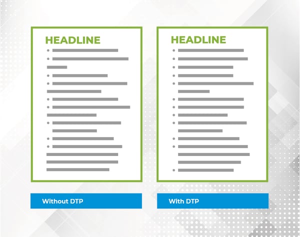 If you use a lot of bullet points in your texts, you probably like to have a neat and tidy margin next to the bullet points. This can be tricky when you translate the text into another language.
Perhaps you think this is only a small detail. But you should never underestimate how much this helps the reader, especially when they are not as familiar with the content as you are. Neatly ordered text conveys information more easily to the reader.
SPECIAL CHARACTERS
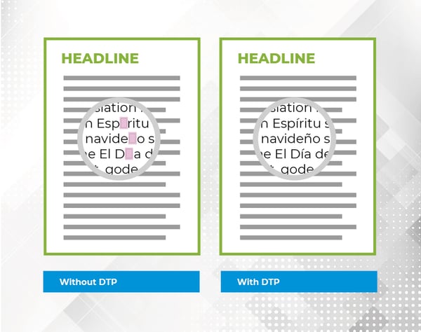 ß æ Ö ç ñ ð Ș Ω ¥ …
Readers notice special characters. Especially when they are next to each other. But when they are a natural part of a text – perhaps in a long text – you do not necessarily spot them as easily.
And in some cases, they are not even read correctly in the text. For example, what happens if the font that is used does not support the character? What happens is your special character with its own special meaning is not shown - instead the reader sees a little empty square.
A graphic design expert is experienced in spotting such character issues. AND knows how to fix them.
TABS
 The tab function is one of those formatting tools that you can easily use inappropriately. For example, using it to make columns in a Microsoft Word document.
You can perhaps fiddle around with spacing and wording to make it look good enough in one language. But when it is translated into another language, it can become a complete mess.
It can also be one of the most difficult formatting problems to fix if the “damage” has already been done before the translation. Perhaps you have some painful experience of this already?
"TO DTP OR NOT TO DTP"
In some situations, it may make sense for you to do the fine polishing of the layout of the translations yourself if you know the language or languages and you or your colleague have graphic design competencies or if there are pressing time/budget constraints. But there will be many situations where it makes good sense to give the task to experienced specialists who are used to dealing with many foreign languages. AND moreover, get the translator to check the final text before it is printed or published.
ANTICIPATE LAYOUT ISSUES
.png?width=282&height=282&name=Skabelon_baggrund%20til%20portr%C3%A6tter(3).png)
|
Our graphic design team are experts in all of the work involved in layout, graphics and design – both before and after the translation work. They will easily take care of all of the work for you. Ask us a question about layout workshops 💌
|